
GalleryPal
Helping museum visitors appreciate art | Mobile app, 2023
Developing a new learning tool
▸ The Problem
Museums, and other art institutions, offer visitors various ways of learning more about the art on display, including wall-mounted labels and exhibit catalogues. But these have their limitations. For instance, wall-mounted labels can be hard to read in a crowded room. When the available ways of learning aren’t readily accessible, visitors may be frustrated and even struggle to appreciate the art.
▸ The Solution
GalleryPal is a mobile app that puts learning about art at the fingertips of museum visitors, leveraging a variety of familiar, comfotable, and unobtrusive multimedia methods, including assisted reality and audio guides.
▸ My Process
GalleryPal was born of a week-long creative sprint. I received a problem to be solved with a mobile app, as well as a few preliminary research materials, and I planned a strict design schedule resulting, by the end of the week, in a proof-of-concept for a product.
Day 1: Understanding users
▸ The Visitor Perspective
A series of interviews had already been conducted with museum visitors. I identified several common themes:
Visitors enjoy art but want to appreciate it on a deeper level.
Visitors are frustrated when ways to learn about art aren’t readily accessible.
Visitors mostly want to explore and learn on their own, not in a tour group.
“I like to form my own opinion about art, but it can be hard to do that when I don’t really know anything about the artist, or what their intentions were in creating the work.”
— Museum Visitor
▸ The Tour Guide Perspective
There was also an existing interview with a museum tour guide, which offered further insights into visitors’ needs and behaviors:
Visitors need expert guidance to appreciate art on a deeper level.
Appreciating art involves forming personal connections with it.
“At the end of the day ... artwork is really meant to also sort of understand yourself in an interesting way.”
— Museum Tour Guide
▸ User Persona
Synthesizing what I’d learned from the interviews, I developed a simple user persona that would guide my thinking about how best to meet the needs of museum visitors so that I wasn’t just relying upon my personal experiences of visitings museums.

The Budding Art Enthusiast
Key traits:
Enjoys visiting museums by herself
Prefers seeing art that she hasn’t already seen before
Prefers not to research art ahead of time
Wants a simple, self-directed way of learning more about art while inside museums
Day 2: Generating ideas
▸ Competitive Analysis
Of course, I wasn’t the first person in history to approach learning about art with an app, so I needed to know what sorts of apps museum visitors were potentially already using. This would help me to identify existing patterns worth adapting and room for improvement. I focused on three popular apps.

National Gallery of Art App
Principally an interactive map of the National Gallery of Art
Features text and audio descriptions of major works of art
Features a list of “must see” art

Smartify
Identifies art with the user’s camera
Features interactive explorations of art
Features a shop with related merchandise
Daily Art
Offers daily opportunities to learn about art
Features interactive explorations of art
Links to further reading and related art
Allows users to curate lists of favorite art
▸ Crazy Eights
I used the “crazy eights” method to brainstorm eight very different ways to help my user persona learn about art. My sketches ranged from a practical, if dull, solution inspired by Wikipedia to a more fanciful one inspired by the augmented realty game Pokémon GO.

Day 3: Choosing a direction
▸ Storyboards
The solutions I’d brainstormed varied widely in terms of creativity and practicality. I wanted to design an app that was engaging but could also readily be turned into a reality, so I picked the solution that seemed most balanced and began sketching the major screens.

▸ Moodboard
To determine what the screens of the app would look like, I gathered imagery reflecting key ideas that the app should convey:
Self-reliance
Discovery
Friendly guidance
Imagery suggested muted colors and simple visuals that wouldn’t compete with the art that the user was trying to appreciate.

Day 4: Building a prototype
▸ Key Screens
I translated my storyboards into rough designs in Figma, breathed a bit of life into them with colors and visuals informed by my moodboard, then knit the screens together with interactions to make a prototype for testing on potential users.

Map
A map of the museum that the user is visiting
Features:
Building/floor selector
Search box
Buttons that reveal details and directions
“Locate me” button that centers the user’s location on the map

Must See
A list of popular works of art in the current museum
Features:
Building/floor selector that filters art by location
Search box
Buttons that open the map and show directions

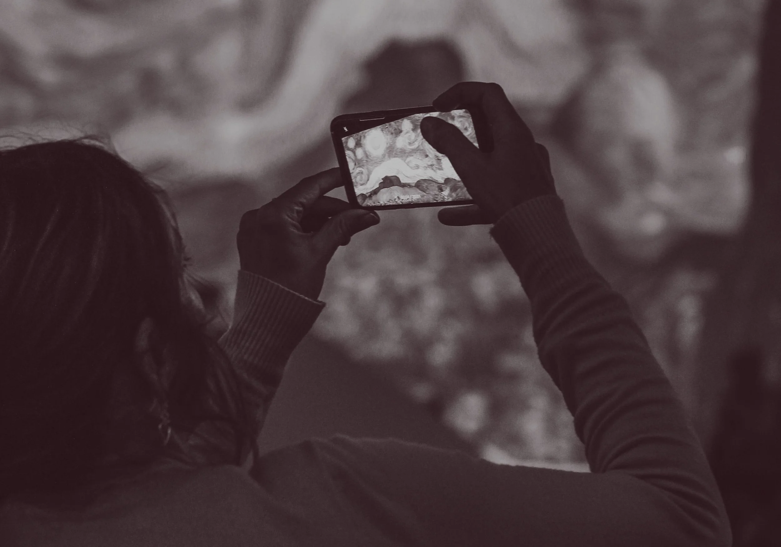
Examine
An augmented-reality function allowing users to identify and interact with art through their cameras
Features:
Header with basic information about the art in view
Dialogue box with a detailed narrative about the art
Highlighted portion of the art, as discussed in the dialogue box
“Add to favorites” button
“Audio guide” button

Favorites
A list of art selected by the user to remember or revisit later
Features:
Building/floor selector that filters favorites by location
Search box
Buttons that expand sections to reveal a location button and links to further reading and items in the gift shop
Day 5: Gathering feedback
▸ Usability Tests
I recruited five test subjects. I asked them to imagine entering a museum that they’d never visited before, and I led them through a set of prompts such as “You particularly like a piece of art and want to remember it later. What might you do with the app to facilitate this?”
Findings:
Participants successfully and smoothly completed all prompts, validating the design.
Participants appreciated how the app facilitated access to information, and they wanted even greater access.
Participants appreciated how they could curate favorites, and they wanted additional ways of customizing the app.
“Being able to have a guide like this in your own hands ups accessibility.”
— Test Subject
▸ Final Thoughts
It was gratifying to see that I had indeed designed an app that, if polished and built, could help actual museum visitors learn about and have more fulfilling experiences with art. My biggest takeaway, however, was an enriched understanding of the thoughtfulness and care at the heart of learning-related design, which I’ve carried forward into my work.