

El Locale
Helping small businesses communities thrive | El Locale, 2024
Connecting small businesses and customers online
▸ The Problem
During the COVID-19 pandemic, people wanted to support their local small businesses, but in many cases, these businesses lacked robust platforms for online shopping and therefore struggled. And after the pandemic, these businesses didn’t necessarily regain their pre-pandemic success, because people continued to do much of their shopping online.
▸ The Solution
El Locale is a location-based e-commerce platform for small businesses to help build and strengthen their customer base and ensure their financial health in a world where people shop less in person.
Stepping into the project
▸ The Challenge
Design of the platform was already underway when I came aboard. The El Locale startup had researched e-commerce platforms and customer behavior and drafted a number of screens as a proof-of-concept. But it needed help refining designs and developing additional screens to complete a prototype for usability testing.
▸ My Role
I led a team of three designers — Stephanie Hua, Leah Kusumalayam, and Gautam Reddy — and took charge of translating the startup’s research into a design strategy, gathering and synthesizing feedback from the CEO, and knitting our collective work into a prototype in Figma.
Understanding the customer
▸ Synthesis of Existing Research
The startup’s research offered valuable insights into customers’ needs, as well as their expectations for e-commerce platforms. My team used these to determine a core set of tasks that customers would have to perform with El Locale:
Creating an account
Searching for an item/store by name/category
Filtering search results by distance
Saving an item/store for later
Adding an item to the cart/editing the cart
Purchasing an item
Seeing account details
Updating an order
Saving/editing a credit card
Adding/updating billing/shipping information
I then mapped out these tasks in user flows that helped us to identify screens that still needed to be designed and how the various screens, new and existing, would fit together in the eventual prototype.
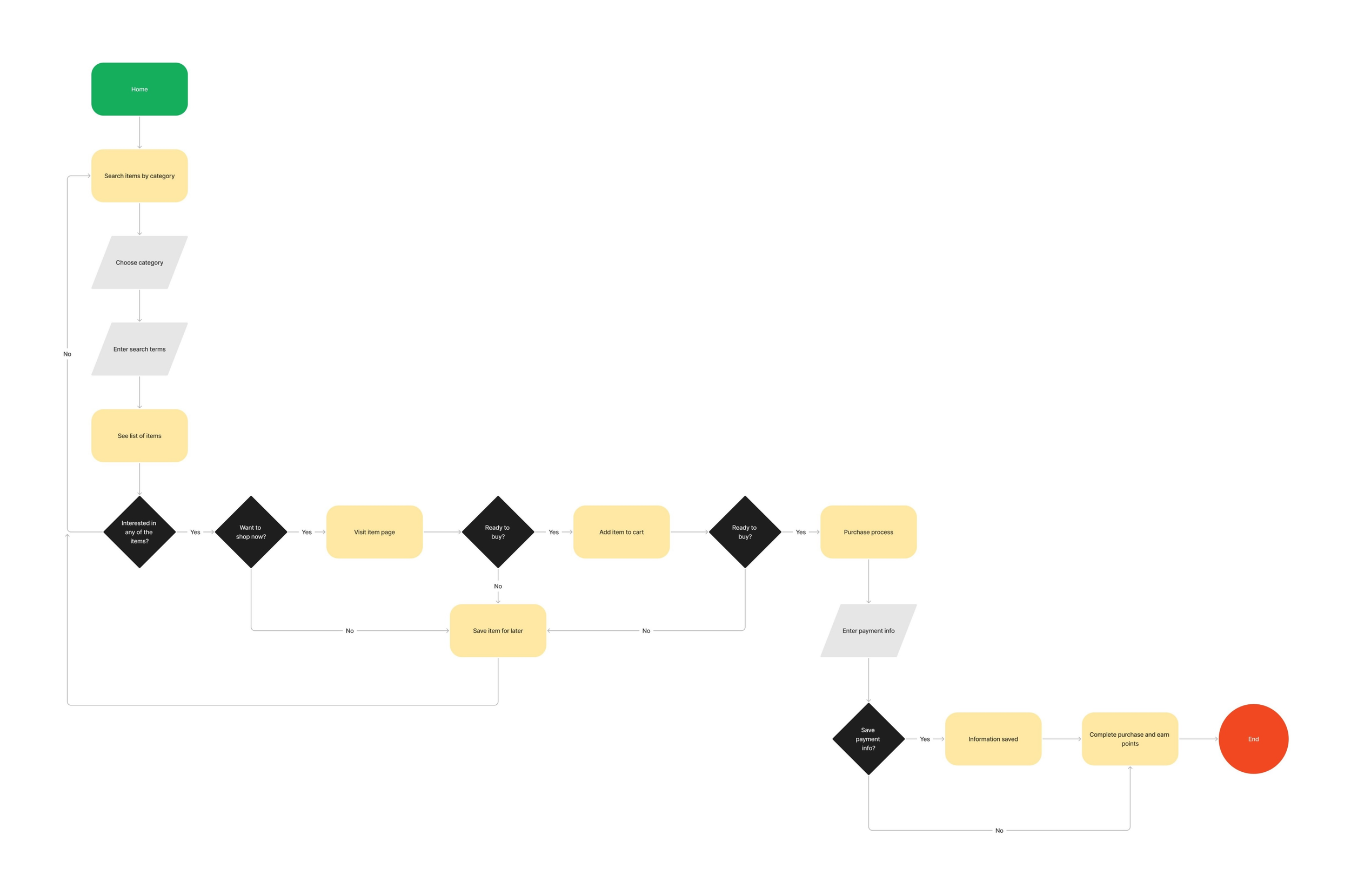
The user flow for purchasing an item, one of the less complex tasks
Designing the remaining screens
▸ Additional Competitive Analysis
A number of new screens had to be designed: for instance, screens for account creation and signin. El Locale was already heavily inspired by the e-commerce giants Amazon and Etsy, so we consulted these for tried-and-true patterns to adapt.

Account creation/signin patterns:
Account creation/signin accessed through an “Account” link in top-level navigation
Clicking “Account” triggers a popup with a signin button and an account creation link
Verifies new users through a text message

Account creation/signin patterns:
Account creation/signin accessed through a “Sign in” link in top-level navigation
Clicking “Sign in” triggers a popup form for signin with an account creation button
Verifies new users through email
▸ New Screens
In the case of account creation and signin, Amazon offered a simpler flow than Etsy and better matched El Locale’s aesthetic. But we also borrowed Etsy’s verification process because it didn’t require desktop users to interact with another device. This more time-honored approach to verification seemed better for users with varying comfort levels regarding technology.

Flows in Amazon (top) and El Locale (bottom)
▸ Updates to Existing Designs
New designs also revealed certain limitations of existing screens and components. For instance, the original navigation header didn’t account for the user’s location, favorites, or searching by categories. These all had to be updated.
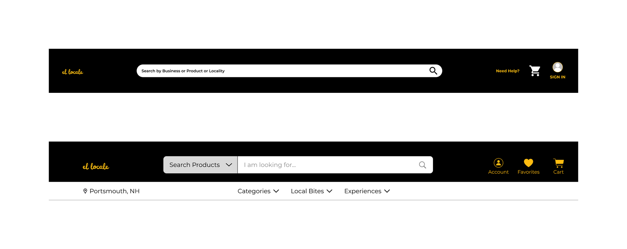
Ex. Original (top) and final (bottom) navigation bars
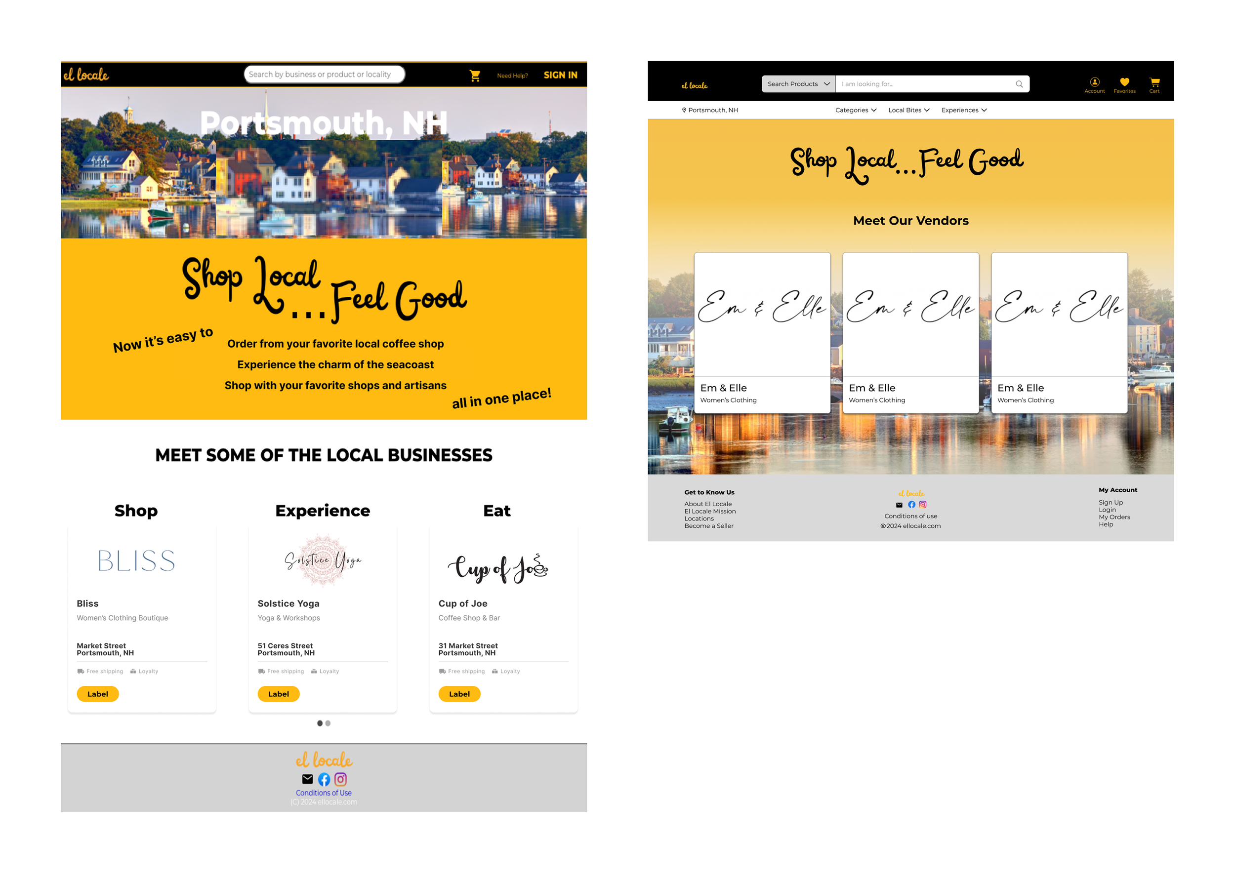
Original (left) and final (right) home screens
Validating the prototype
▸ Company Feedback
We at last had a fully fleshed-out, clickable prototype in Figma. We’d gathered feedback from the CEO throughout the design procss, but a final, concentrated round of feedback was needed for identifying gaps before testing more broadly.
Feedback:
The CEO requested no major changes, validating the design direction.
Some screens needed minor simplification, hiding features that wouldn’t be available at the launch of the platform.
▸ Final Screens
The prototype prioritized simplicity of interaction and a minimalist aesthetic that would translate easily across devices and make the platform accessible to a broad spectrum of customers. We handed off materials to the CEO for sharing with a subseqent team that would begin building the app.

Final designs for search results for items (top) and businesses (bottom)