Brown University Event Posters
Attracting new attendees to academic programming | 2021–present
Communicating with an in-person audience
▸ The Higher Education Landscape
Although event publicity in the world at large may now be predominately digital, print posters remain a significant medium on college and university campuses because of the captive in-person audience of students, staff, and faculty. Posters are especially important for units like Brown University’s Cogut Institute for the Humanities, which lack degree programs and so have to build a constituency through other means, such as enticing people to attend their events.
▸ My Process
For every poster I design at the Cogut Institute, I gather ideas from various sources, including the event’s conveners and the abstracts of the speakers’ talks. Then I produce several drafts and share them with my team for feedback, before finalizing a single design. With many posters to create — among other communications duties — I have relatively little time to devote to any one poster, but I gather insights from every project and implement new ideas on subsequent ones.
Developing a design lexicon
▸ Organizing Information
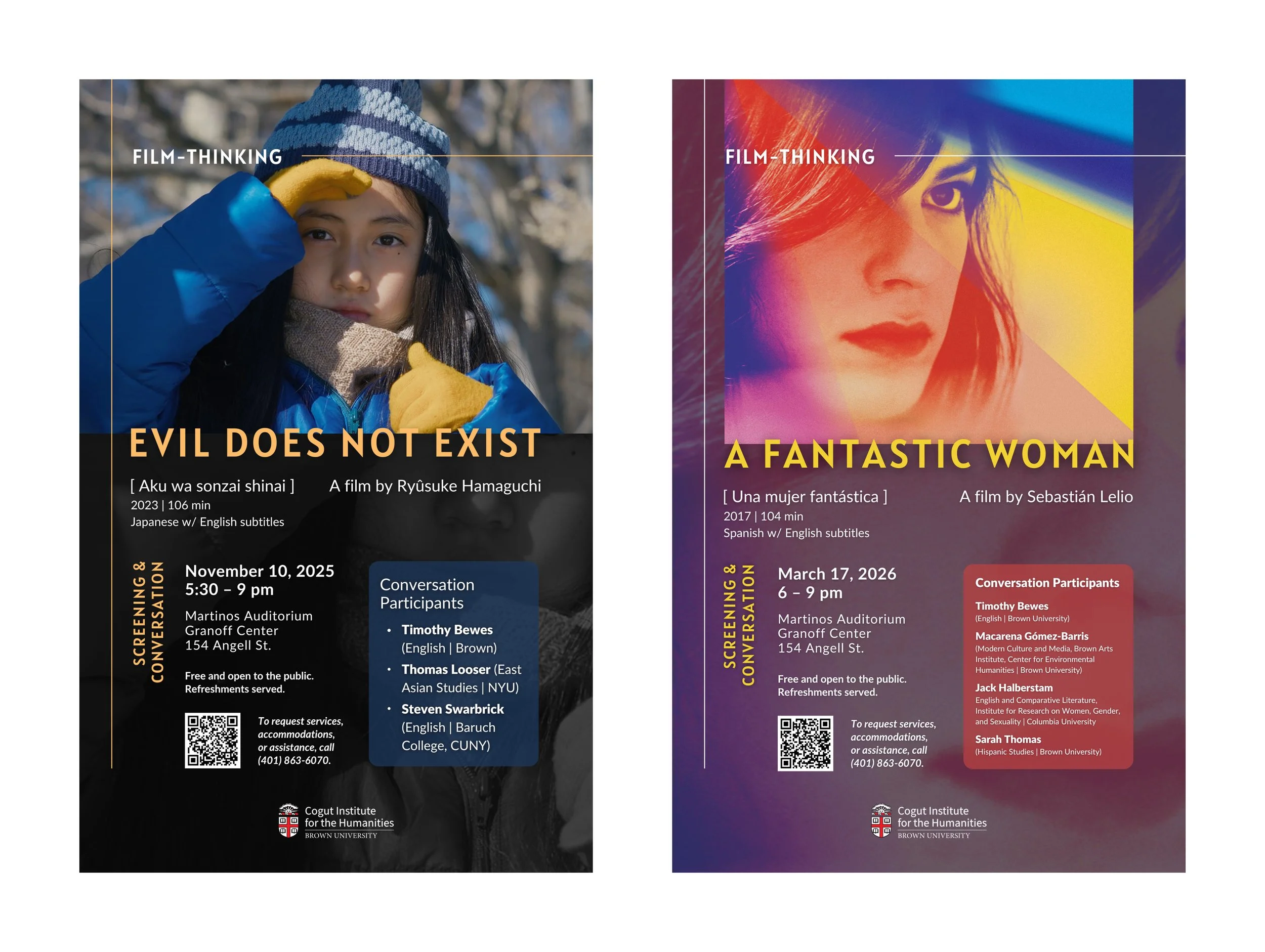
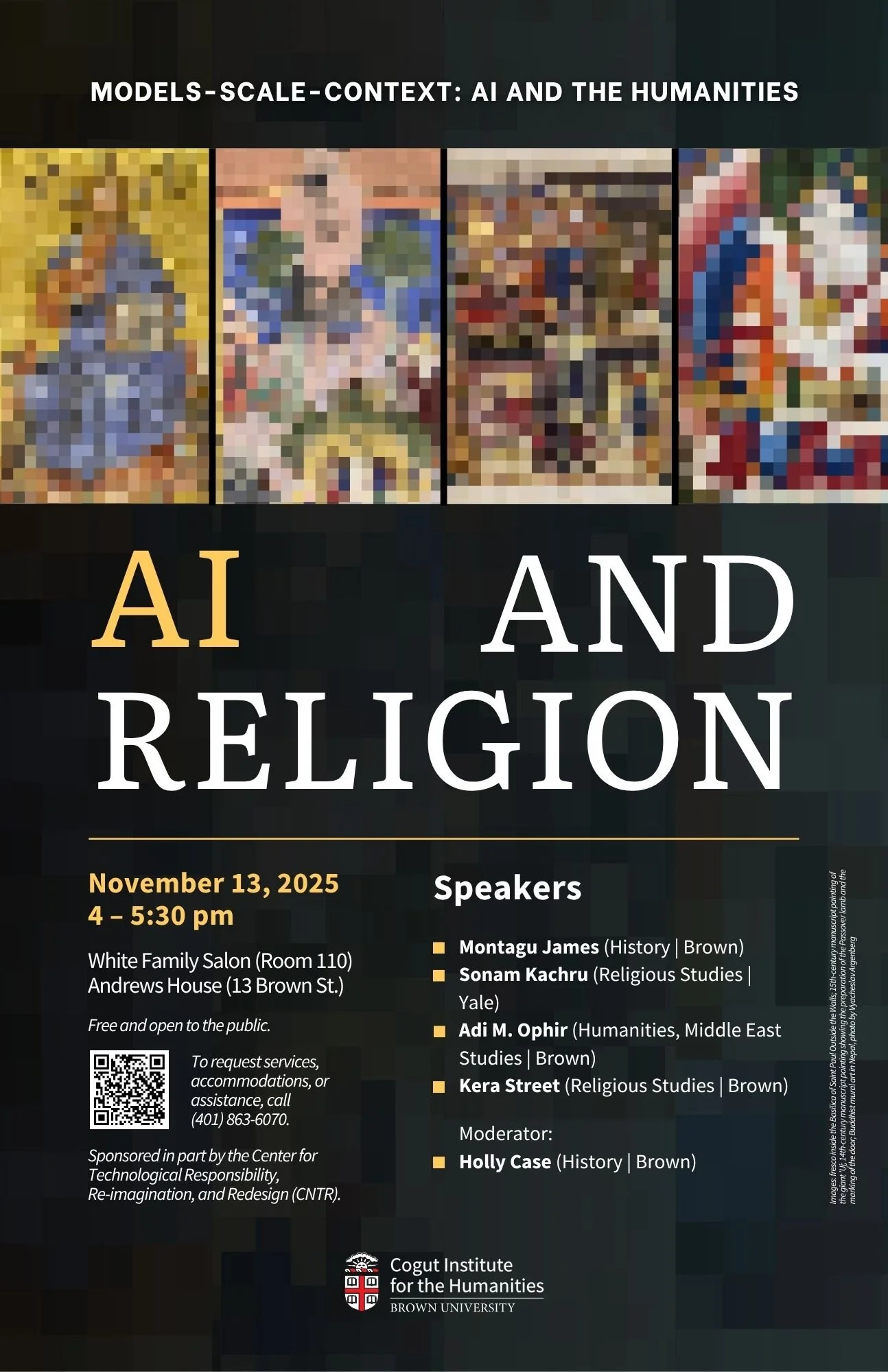
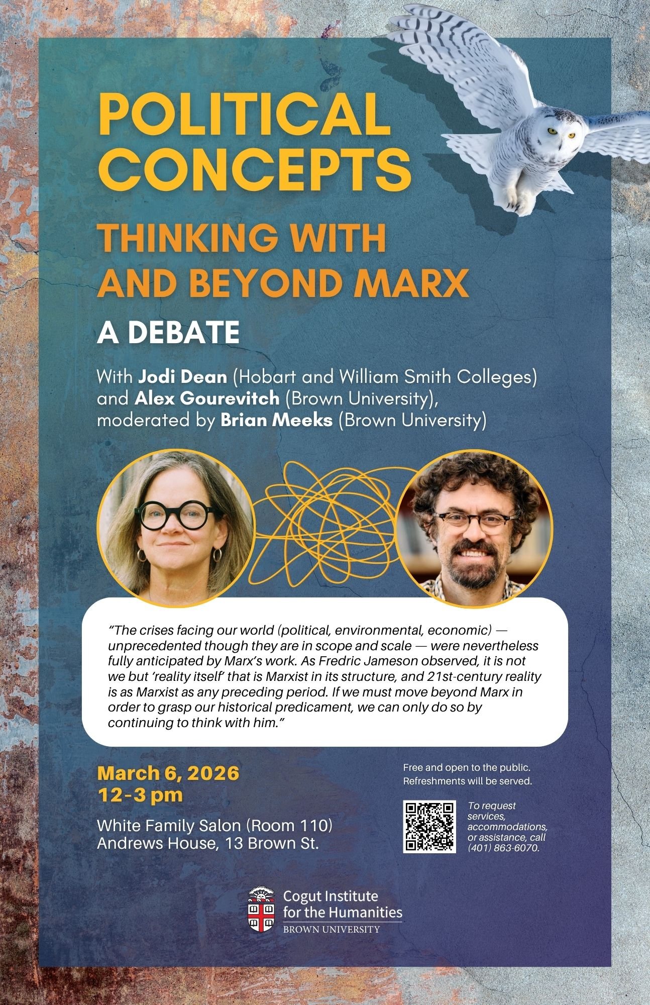
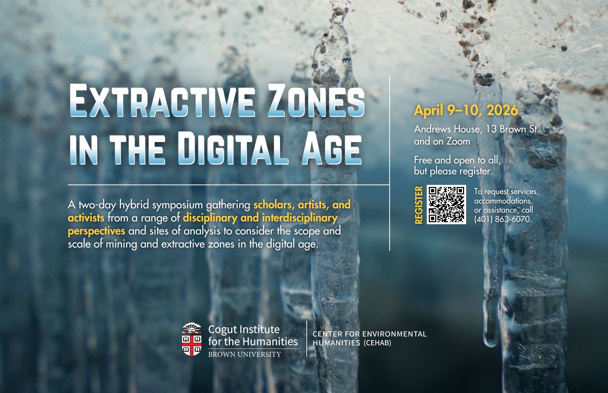
The institute’s events typically have multiple speakers, are part of a series, or have auxilliary sessions such as workshops for small groups. Posters thus require a large quantity, or multiple competing sets, of details, making it difficult both to convey information hierarchy and create attractive designs. However, thoughtful use of fonts, text sizes, colors, graphic elements, and empty space can create intuitive, appealing patterns and movement that guide a reader’s eye.
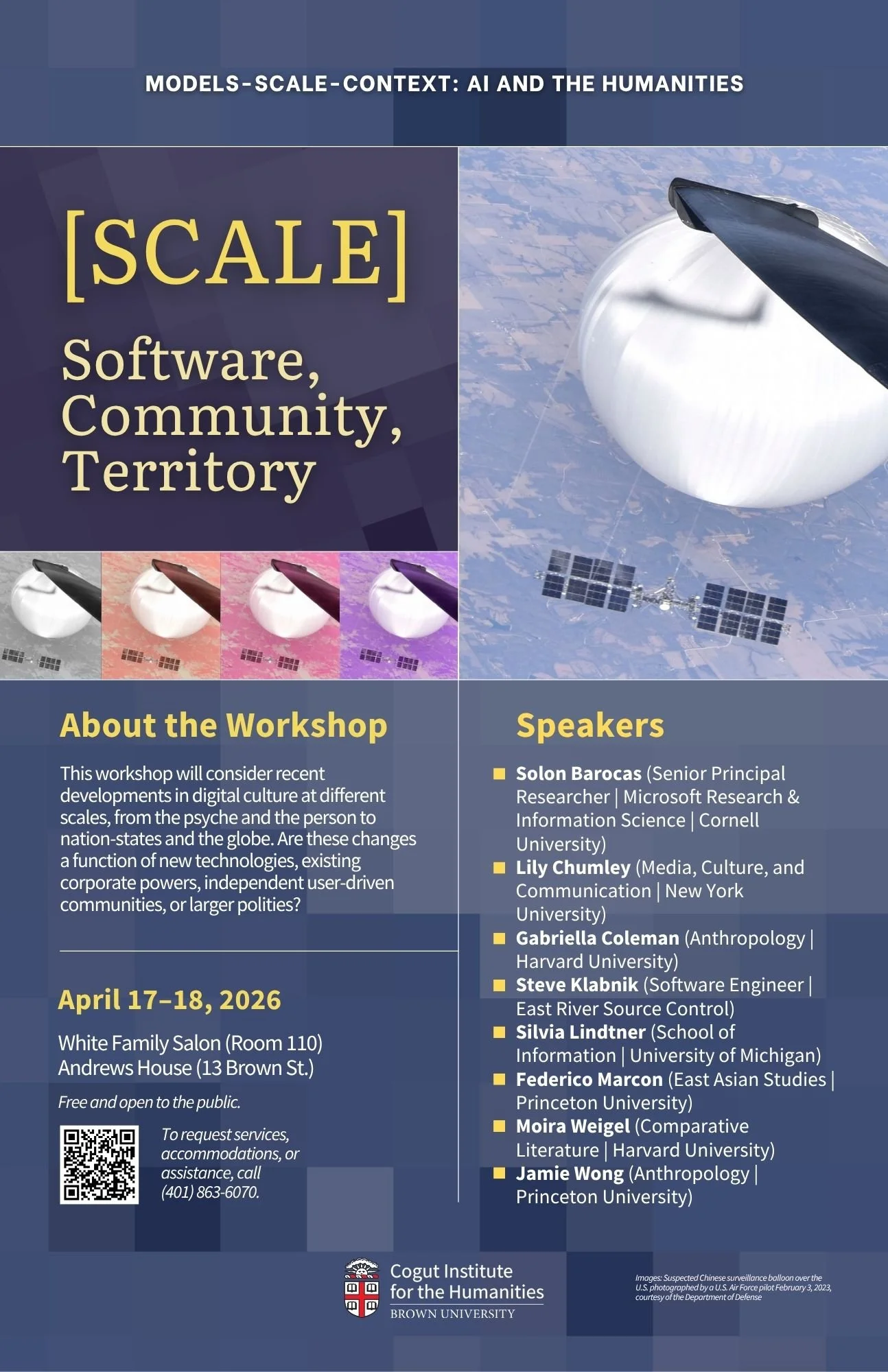
▸ Conveying Capacious Themes
The institute’s events also explore broad or complex themes, even sets of interrelated themes, reflecting an interdisciplinary approach to scholarship. But how can a designer illustrate things that can’t readily be summarized?
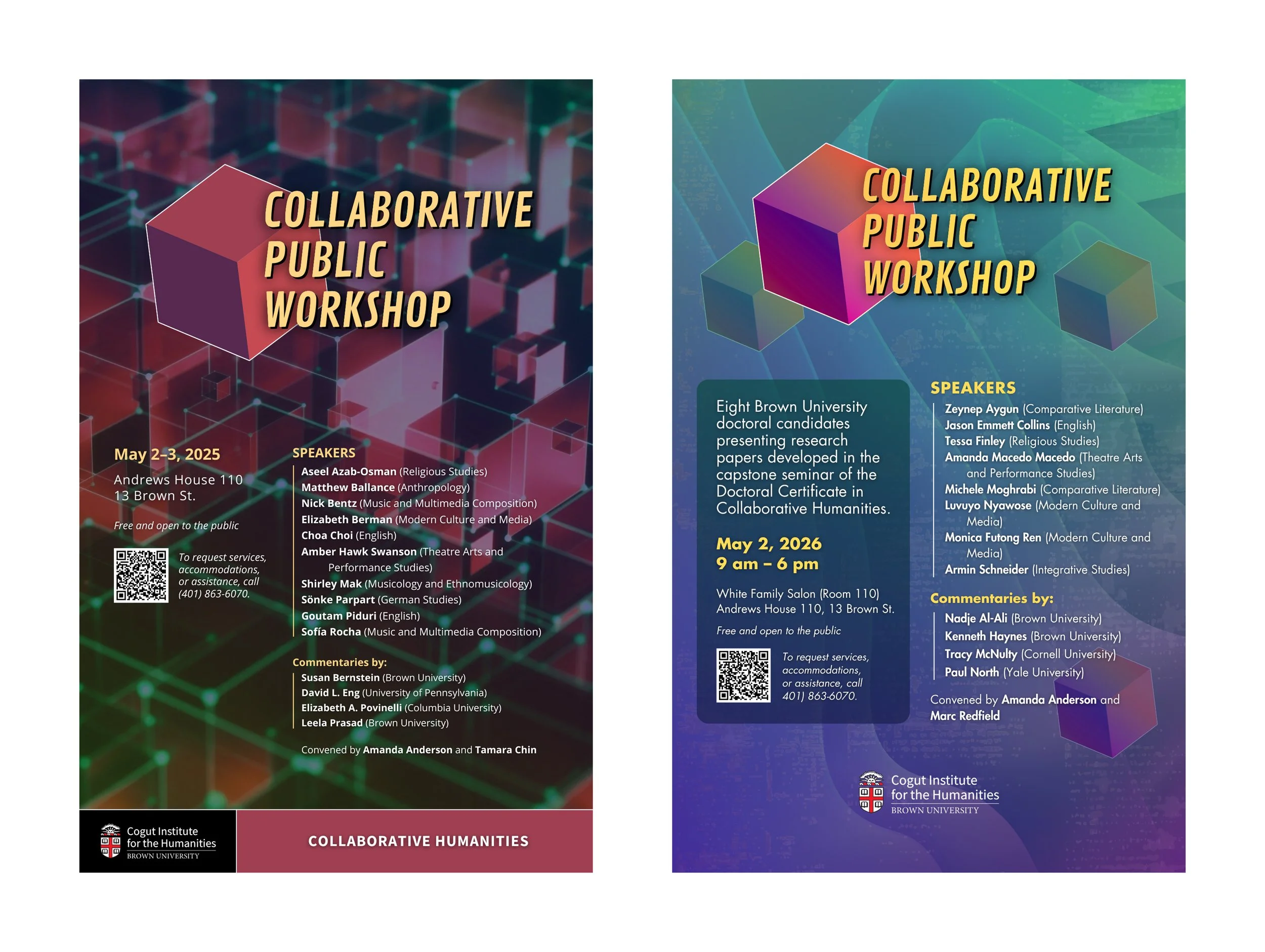
The annual “Collaborative Public Workshop,” for instance, is a showcase for research by doctoral students across departments. No single concrete image could encapsulate this, so considering instead how these students’ projects are being placed into conversation, I’ve developed abstract imagery suggesting overlap, interconnectedness, etc.
Iterating within and beyond projects
▸ Drafting in Multiples
For every poster, I create multiple drafts, or a single design with multiple variations in color and typography, to share with stakeholders so they can choose favorites and suggest revisions. This helps me to identify viable ideas quickly.
For example, the conveners of the colloquium “Why Me?” suggested mirror imagery for the poster, so I produced a series of drafts with significantly different mirror artwork. This helped the conveners to articulate a need for imagery avoiding indicators of race and gender, so I moved forward with revising a draft that had a wall-mounted mirror and no human reflection.

▸ Refining Over Time
Given my time constraints, at some point a poster simply has to be good enough to print, even if I’m not entirely satisfied. But in working on posters over time, I experiment and discover better practices that inform new projects. This is especially true of posters for events in a series, where I can readily adapt and refine patterns from past events and thus spend my time more effectively.